| View previous topic :: View next topic |
| Author |
Message |
tackerman
The Gates of Troy
Joined: 14 Jun 2006
Posts: 1741
Location: in the ether
|
 Posted: Wed Feb 21, 2007 8:39 am Post subject: Dusting off my photoshop "skillz" Posted: Wed Feb 21, 2007 8:39 am Post subject: Dusting off my photoshop "skillz" |
 |
|
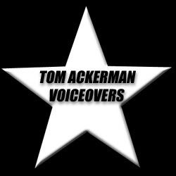
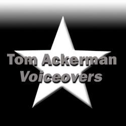
Hey folks. I'm revamping my website and branding. I'm thinking of sticking with voicetom.com instead of my full name. Opinions on what I've cobbled together so far? I haven't used photoshop in a few years... a bit rusty. I'm going with a simple/clean B&W motif.
Tom
LOGOs


BANNERS


Last edited by tackerman on Wed Feb 21, 2007 10:42 am; edited 3 times in total |
|
| Back to top |
|
 |
Donovan
Cinquecento

Joined: 10 Jan 2007
Posts: 595
Location: Raleigh/Durham, NC
|
| Posted: Wed Feb 21, 2007 9:22 am Post subject: |
|
|
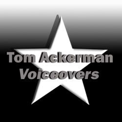
The shadows/shading on the banners look awkward to me. Maybe some minor adjustments on the pixel-width of the shadow might sharpen it up.
_________________
Donovan
www.DonovanVO.com |
|
| Back to top |
|
|
Dave
Lucky 700

Joined: 11 Nov 2004
Posts: 727
Location: Houston, Texas
|
| Posted: Wed Feb 21, 2007 10:04 am Post subject: |
|
|
The drop shadow version is my choice...but I agree with Donovan...its a bit fuzzy. Unfortunately, I only plunk around in PS so I can't be of help at to how to correct the problem.
_________________
. If at first you don't succeed, then bomb disposal probably isn't for you. |
|
| Back to top |
|
|
Deirdre
Czarina Emeritus

Joined: 10 Nov 2004
Posts: 13026
Location: Camp Cooper
|
| Posted: Wed Feb 21, 2007 10:10 am Post subject: |
|
|
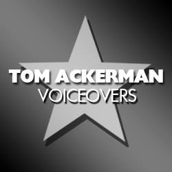
Dear Tom-- please re-think your idea of all caps, especially with italics.
The word VOICETOM looks oddly Cyrillic.
Once you have a typestyle you like, than you can mess about with letter shading, however If you ARE going to stay in black-and-white motif, keep clear of the embossing because it tends to muddy up the letter shapes.

_________________
DBCooperVO.com
IMDB |
|
| Back to top |
|
|
tackerman
The Gates of Troy
Joined: 14 Jun 2006
Posts: 1741
Location: in the ether
|
| Posted: Wed Feb 21, 2007 10:12 am Post subject: |
|
|
Thanks! This is the feedback I'm looking for as I fiddle around.  One instead of 2 stars? One instead of 2 stars?
 |
|
| Back to top |
|
|
Jeffrey Kafer
Assistant Zookeeper
Joined: 09 Dec 2006
Posts: 4931
Location: Location, Location!
|
| Posted: Wed Feb 21, 2007 11:25 am Post subject: |
|
|
| VoiceTom wrote: | Thanks! This is the feedback I'm looking for as I fiddle around. One instead of 2 stars?
|
Honestly, I'm not a fan of the stars. I look at these banners and I think you're running for political office.
Just 2 cents, which I wouldn't expect anyone to pay more than a penny for.
_________________
Jeff
http://JeffreyKafer.com
Voice-overload Web comic: http://voice-overload.com |
|
| Back to top |
|
|
Deirdre
Czarina Emeritus
Joined: 10 Nov 2004
Posts: 13026
Location: Camp Cooper
|
| Posted: Wed Feb 21, 2007 11:47 am Post subject: |
|
|
#1. Whenever you use a graphic element like a star, make sure you have plenty of negative space around it. Your stars are too big for the format.
I'm OK with the star concept, but Dieter thought it was too "militaristic". I told him you were an Airman, and he said "Oh. Well, maybe that's why he likes that look."
I like stars, myself.
#2. If you are going to use all caps, you seriously ought to consider making the "T" of Tom a bit bigger than the other letters.
#3. If you want to say TOM ACKERMAN VOICEOVERS
don't use a hyphen, it looks like you're married to a lady named "Voiceovers".
Use a dot. You can usually find one by pressing shift-alt-9.
or use an em dash shift-alt-hyphen
_________________
DBCooperVO.com
IMDB |
|
| Back to top |
|
|
tackerman
The Gates of Troy
Joined: 14 Jun 2006
Posts: 1741
Location: in the ether
|
| Posted: Wed Feb 21, 2007 1:00 pm Post subject: |
|
|
| Deirdre wrote: |
I'm OK with the star concept, but Dieter thought it was too "militaristic". I told him you were an Airman, and he said "Oh. Well, maybe that's why he likes that look."
I like stars, myself.
I do too. And Dieter's probably right.
|
Thanks for all the tips DB. I'll take another crack at it tomorrow. |
|
| Back to top |
|
|
TheVoiceOfBob
14th Avenue
Joined: 05 Oct 2006
Posts: 1411
Location: Pittsburgher in the Carolinas
|
| Posted: Wed Feb 21, 2007 2:54 pm Post subject: |
|
|
My first thought was it was an election banner. I do like the mixed types like DB demonstrated.
This is a good process to go through. You want to come up with something that will be around for a while.
_________________
Try to imagine a world where there is no such thing as hypothetical situations.
The Voice of Bob |
|
| Back to top |
|
|
Jeffrey Kafer
Assistant Zookeeper
Joined: 09 Dec 2006
Posts: 4931
Location: Location, Location!
|
| Posted: Wed Feb 21, 2007 4:12 pm Post subject: |
|
|
| TheVoiceOfBob wrote: | | My first thought was it was an election banner. |
Interesting you saw the same thing I did.
_________________
Jeff
http://JeffreyKafer.com
Voice-overload Web comic: http://voice-overload.com |
|
| Back to top |
|
|
tackerman
The Gates of Troy
Joined: 14 Jun 2006
Posts: 1741
Location: in the ether
|
| Posted: Wed Feb 21, 2007 4:21 pm Post subject: |
|
|
After I did the first one my thought was a military recruiter.  |
|
| Back to top |
|
|
tackerman
The Gates of Troy
Joined: 14 Jun 2006
Posts: 1741
Location: in the ether
|
| Posted: Thu Feb 22, 2007 4:16 am Post subject: |
|
|
OK, more fiddling this morning. Playing with gradients, drop shadows, etc. I'm not crazy about the grey font...
 |
|
| Back to top |
|
|
davediamondprovo
Contributor IV
Joined: 22 Dec 2006
Posts: 103
Location: California
|
| Posted: Thu Feb 22, 2007 10:28 am Post subject: |
|
|
I find the star a bit ambiguous. Have you ever considered having a third party design your logo? I used http://thelogocompany.net/ for my voiceover logo and I am thrilled with the result:

They did this one also:

The price is extremely reasonable for what you get and the turnaround is great too.
FWIW
_________________
David |
|
| Back to top |
|
|
tackerman
The Gates of Troy
Joined: 14 Jun 2006
Posts: 1741
Location: in the ether
|
| Posted: Thu Feb 22, 2007 10:34 am Post subject: |
|
|
| Thanks Dave. I'll check them out. |
|
| Back to top |
|
|
tackerman
The Gates of Troy
Joined: 14 Jun 2006
Posts: 1741
Location: in the ether
|
| Posted: Sun Feb 25, 2007 2:04 pm Post subject: |
|
|
Check out this version from a friend of mine.
 |
|
| Back to top |
|
|
|

