| View previous topic :: View next topic |
| Author |
Message |
Donna
King's Row

Joined: 08 Feb 2008
Posts: 1118
Location: The studio or the barn.
|
 Posted: Mon Mar 09, 2009 8:59 am Post subject: logo ideas? Posted: Mon Mar 09, 2009 8:59 am Post subject: logo ideas? |
 |
|
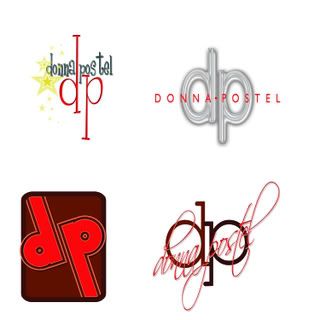
I have a few logo ideas to mull over, but before deciding which one merits further exploration, I thought I'd run them past y'all. ANY thoughts are appreciated!
Thanks, Donna
 |
|
| Back to top |
|
 |
Jeffrey Kafer
Assistant Zookeeper
Joined: 09 Dec 2006
Posts: 4931
Location: Location, Location!
|
| Posted: Mon Mar 09, 2009 9:06 am Post subject: |
|
|
I like the top right corner the best, sorta.
The left top one seems like it's been done before, the font is familiar.
The bottom left feels too retro for my tastes and doesn't tell who you are or what you do.
Bottom right script is too hard to read.
While I like the top right best, I don't think it's a particularly strong logo. Initials as logos are getting to be almost as passe as having a mic.
_________________
Jeff
http://JeffreyKafer.com
Voice-overload Web comic: http://voice-overload.com |
|
| Back to top |
|
|
todd ellis
A Zillion

Joined: 02 Jan 2007
Posts: 10539
Location: little egypt
|
| Posted: Mon Mar 09, 2009 9:49 am Post subject: |
|
|
i like a combination of the right side. the initials from the bottom with the name in a more reasonable - probably sans serif font in a contrasting color through the middle. your initials are thin - so maybe a bolder, yet small font.
jmho
_________________
"i know philip banks": todd ellis
who's/on/1st?
 |
|
| Back to top |
|
|
Deirdre
Czarina Emeritus

Joined: 10 Nov 2004
Posts: 13026
Location: Camp Cooper
|
| Posted: Mon Mar 09, 2009 10:02 am Post subject: |
|
|
I love love love the upper left one. It's whimsical without being sappy.
Not to criticize anyone's criticism, of course we don't want anyone going POSTEL.
HA HA !!! I'll bet you've never heard that before.

_________________
DBCooperVO.com
IMDB |
|
| Back to top |
|
|
Donna
King's Row
Joined: 08 Feb 2008
Posts: 1118
Location: The studio or the barn.
|
| Posted: Mon Mar 09, 2009 10:12 am Post subject: |
|
|
Whatever do you mean, Deebs, go POSTAL??? I had been thinking about a 'special delivery' theme, but ...
Todd, I will play around with your suggestions and see what we come up with. I was think along those lines, too.
Yeah, Jeff, bottom left is definitely Brady Bunch.
Many thanks for your input! Anyone else? |
|
| Back to top |
|
|
DaveChristi
King's Row
Joined: 03 Aug 2006
Posts: 1033
Location: Bend, OR
|
| Posted: Mon Mar 09, 2009 12:34 pm Post subject: |
|
|
1st choice - bottom left. I like simplicity.
2nd choice - top left. Like DB said, whimsical.
IMHO 
_________________
Dave "Christi" Felton
The Character Voice Actor |
|
| Back to top |
|
|
Mandy Nelson
MMD
Joined: 07 Aug 2008
Posts: 2919
Location: Wicked Mainah
|
| Posted: Mon Mar 09, 2009 12:45 pm Post subject: |
|
|
Top right is my fave of the four. I guess it depends on the image you want to portray - top left is fun while top right is more serious.
_________________
006 member of the Sisterhood of the Traveling Mic. Bonded by sound.
Manfillappsoc: The Mandy and Philip mutual appreciation Society. Who's in your network?
Have you seen my mic closet? ~ me to my future husband |
|
| Back to top |
|
|
Bill Campbell
DC

Joined: 09 Mar 2007
Posts: 621
|
| Posted: Mon Mar 09, 2009 12:54 pm Post subject: |
|
|
Donna:
If you specialize in a fun, high energy style, I would use the upper left.
However, I don't think "talent" necessarily NEED a logo, unless it's over the top memorable.
You want them to remember your name. I never went to his website
(did he have one?) but I can't imagine Don LaFontaine needed a logo!
Just find an interesting font, for your NAME, that fits your voice niche.
_________________
www.asapaudio.com |
|
| Back to top |
|
|
DaveChristi
King's Row
Joined: 03 Aug 2006
Posts: 1033
Location: Bend, OR
|
| Posted: Mon Mar 09, 2009 1:00 pm Post subject: |
|
|
I'm not sure that's a good comparison. Don established his "brand" years before the VO market exploded into what it is today.
<soapbox>
Remember: "You are your brand". If you're going to be doing any marketing at all, I think its a good idea to establish your brand both audibly and visually.
</soapbox>
_________________
Dave "Christi" Felton
The Character Voice Actor |
|
| Back to top |
|
|
Donna
King's Row
Joined: 08 Feb 2008
Posts: 1118
Location: The studio or the barn.
|
| Posted: Mon Mar 09, 2009 1:03 pm Post subject: |
|
|
| BTW Dave, I love YOUR logo! |
|
| Back to top |
|
|
Bill Campbell
DC
Joined: 09 Mar 2007
Posts: 621
|
| Posted: Mon Mar 09, 2009 1:18 pm Post subject: |
|
|
The Don is certainly the extreme example. But, I would prefer to brand the NAME, and not include the initials,
otherwise there's two messages in the logo.
Your professional name should be your logo.
How do you pronounce Postel? If its like Postal, why not
put your name in a postage stamp type logo....
Donna Postel
FOREVER
_________________
www.asapaudio.com |
|
| Back to top |
|
|
CarynClark
MMD
Joined: 28 Feb 2007
Posts: 2697
Location: Fort Myers, FL
|
| Posted: Mon Mar 09, 2009 1:32 pm Post subject: |
|
|
I have to say, even if you don't pronounce "Postel" like "postal" I kinda like the postage stamp idea... b/c most people are likely going to pronounce it "postal" and think of that when they see your name.
But, taking that a step further... what does it have to do with how you sound? A postage stamp doesn't really portray a sound. But, if you can think of descriptors, there could be a way to illustrate the stamp so it portrays your sound.
_________________
Caryn Clark... The Hip Chick Voice!
"A positive mental attitude and having faith in your ability is quite different from being irresponsible and downright stupid." - Dave |
|
| Back to top |
|
|
DaveChristi
King's Row
Joined: 03 Aug 2006
Posts: 1033
Location: Bend, OR
|
| Posted: Mon Mar 09, 2009 1:36 pm Post subject: |
|
|
I think Bill is onto something with the stamp. Just like Bob Souer's logo could have a lemon wedge behind it. 
_________________
Dave "Christi" Felton
The Character Voice Actor |
|
| Back to top |
|
|
Pam
The Thirteenth Floor

Joined: 21 Jul 2006
Posts: 1311
Location: Chicago, Il
|
| Posted: Mon Mar 09, 2009 2:12 pm Post subject: |
|
|
I just LOVE the upper left one as well. It says cool talk show to me. I guess it would depend on how you describe and market your voice. Your image should reflect what your voice sounds like.
Good luck!
_________________
Pam Tierney
www.pamtierneyvo.com
imdb profile http://imdb.com/name/nm1941932/
Now what did I come in here for? |
|
| Back to top |
|
|
Jeffrey Kafer
Assistant Zookeeper
Joined: 09 Dec 2006
Posts: 4931
Location: Location, Location!
|
|
| Back to top |
|
|
|

