| View previous topic :: View next topic |
| Author |
Message |
Jason Huggins
The Gates of Troy
Joined: 12 Aug 2011
Posts: 1846
Location: In the souls of a million jeans
|
 Posted: Sat May 05, 2012 8:53 pm Post subject: New Commercial Demo and Website Posted: Sat May 05, 2012 8:53 pm Post subject: New Commercial Demo and Website |
 |
|
I've posted a number of times on the other forum, however, I haven't much here. Either way, I am relatively new to VO and have put together a commercial demo and website that I'd love some input on.
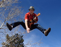
The picture is a place holder while I have something better developed...I have already gotten feedback that it is kind of intimidating and not doing me much good. However, it's the best I have right now...just know, I'm working on that one.
Any input is joyfully welcome, I have thick skin...I wanna get my start right.
Thanks!
Here's the link: www.SpeakwithJason.com |
|
| Back to top |
|
 |
swduncan
Contributor
Joined: 03 May 2012
Posts: 28
Location: Milwaukee, WI
|
| Posted: Sun May 06, 2012 6:40 am Post subject: |
|
|
Hi Jason!
Speaking just on the website, and just from the general-business point of view:
1. Nice look! It's concise, and gets the point across.
2. The photo fits, and you might find it hard to find something better.
2. Move the login and register links below the fold, unless they will be used by clients. If they will be used by clients, change login to "Client Login" and make it much bigger. If they're just for you/the web host you're using, then put them in the footer and make them small, or just remove them and use a bookmark.
3. I'm interested to hear what others say about the free demo badge. I'd change it to "Get a demo of your project." or the like. |
|
| Back to top |
|
|
Bruce
Boardmeister

Joined: 06 Jun 2005
Posts: 7980
Location: Portland, OR
|
| Posted: Sun May 06, 2012 8:20 am Post subject: |
|
|
And now for something completely different.
I think the dark tone to your page and your photo are totally incongruous to your demo which is comparatively happy, lively, bright and fun.
My kindly suggestion is either revise your demo to add more snark and bad ass (which are still popular styles these days), or soften your visual scheme. And that doesn't mean the visuals have to be boring, just not in heavy opposition to your work.
At first viewing, without listening to a second of your demo, I made a quick handful of decisions about how you would sound, and when I played it I was proven wrong.
B
_________________
VO-BB Member #31 Enlisted June, 2005

I'm not a Zoo, but over the years I've played one on radio/TV. . |
|
| Back to top |
|
|
Bailey
4 Large

Joined: 04 Jun 2005
Posts: 4336
Location: Lake San Marcos... north of Connie, northwest of the Best.
|
| Posted: Sun May 06, 2012 8:22 am Post subject: |
|
|
Jason... welcome to the VO-BB.
The website layout seems to work. The photo doesn't work for me... too imposing. It may just be me.
My ear isn't as good as others on this board, but your demo sounds very professional.
_________________
"Bailey"
a.k.a. Jim Sutton
Retired... Every day is Saturday, except Sunday.
VO-BB Member #00044  .gif" alt="W00T" border="0" /> .gif" alt="W00T" border="0" />
AOVA Graduate 02/2004 ;
"Be a Voice, not an Echo." |
|
| Back to top |
|
|
Jason Huggins
The Gates of Troy
Joined: 12 Aug 2011
Posts: 1846
Location: In the souls of a million jeans
|
| Posted: Sun May 06, 2012 8:48 am Post subject: |
|
|
Thanks for the feedback!
For the login, yes it is a client login, I will add that so it is clear.
Great feedback on the site to demo message. I will totally look into a good fix for that. I definitely want the site to be consistent with the demo. As a musician, there is nothing worse than lyrical mood not matching musical mood. Thanks! I do plan to add a narration demo and an imaging demo (which should add some edge). Do you feel that with happy and edgy demos, it would still not fit? Maybe finding a good happy medium.
Thanks again for the feedback. I will contemplate it all. |
|
| Back to top |
|
|
Jason Huggins
The Gates of Troy
Joined: 12 Aug 2011
Posts: 1846
Location: In the souls of a million jeans
|
| Posted: Tue May 15, 2012 8:36 pm Post subject: |
|
|
Ok...I tweaked the demo a bit. Client login is going to be fixed to make it more obvious. I'm still back and forth on the picture, I gotta find something better as a brand image...but for now, it kinda fits.
Also, I added a unique bit of audio. Let me know what you think.
www.SpeakwithJason.com |
|
| Back to top |
|
|
Lori Berman
Contributor III

Joined: 21 Mar 2010
Posts: 97
Location: Bawwwstin
|
| Posted: Thu May 17, 2012 5:17 pm Post subject: |
|
|
I think your demo is great but i agree your photo is a bit imposing. I'm not against having a photo but i think if you make that choice you want something a bit more "welcoming' and certainly one more representative of your brand/your demo. Other than that it seems the site looks good and is easy to navigate, which is important. I'd just rethink that photo (or photo choice)
_________________
-Lori
www.loribermanvoice.com |
|
| Back to top |
|
|
ballenberg
Lucky 700
Joined: 10 Nov 2004
Posts: 793
Location: United States
|
| Posted: Thu May 17, 2012 6:30 pm Post subject: |
|
|
Hey Jason--
True. The photo doesn't help you. I wouldn't worry about adding snarky spots. Just follow the best advice for VO's--no photo.
No matter how you look, someone will make a decision on how you sound/perform based on the picture. In a business where that matters not a bit, it's just better to remain faceless.
After an ISDN session, the female producer told me the creative team had been imagining what I looked like . She asked me to confirm that her guess was accurate: That I looked just like Tom Selleck. " Why yes, I said. Yes, I do."
And this is why I love ISDN and have no pictures on my website. |
|
| Back to top |
|
|
Philip Banks
Je Ne Sais Quoi

Joined: 20 Jun 2005
Posts: 11083
Location: Portgordon, Scotland
|
| Posted: Fri May 18, 2012 2:51 am Post subject: |
|
|
A web site for us is The full Scottish Breakfast, an inviting feast.
A few years ago there was a lot of chat on this site about what arrives on the plate to make up the above named meal. One thing for sure was a big FAT ...NO!
On our way to the Orkney islands the car was stopped just north of Inverness for breakfast. I ordered 4. Two guests were DB and Mr DB. On the plate was the ...NO! Not only did DB eat hers she cruelly stole one slice from the plate of Mr DB. A Constable was NOT summoned which I believe sent out the wrong signals ..I was out voted and Mr DB, in fear of his life remained dignified and silent.
What did DB make of the NO!!!! Delish ....apparently.
Photo or not? If it is part of THE Full Scottish Breakfast you would serve to someone else then yes it does, if not then leave it off.
Great pipes do not need a photo. If all of who you are makes up the sound people buy then the site needs to give a bit more than samples, testimonials and contact details.
Zen VO marketing lessons available now delivered by suppository or hypodermic dart. |
|
| Back to top |
|
|
ballenberg
Lucky 700
Joined: 10 Nov 2004
Posts: 793
Location: United States
|
| Posted: Fri May 18, 2012 3:01 am Post subject: |
|
|
| My suggestion: Stick with the dart |
|
| Back to top |
|
|
Philip Banks
Je Ne Sais Quoi
Joined: 20 Jun 2005
Posts: 11083
Location: Portgordon, Scotland
|
| Posted: Fri May 18, 2012 3:26 am Post subject: |
|
|
I HAVE a Sniper's eye!
He wants it back too |
|
| Back to top |
|
|
Jason Huggins
The Gates of Troy
Joined: 12 Aug 2011
Posts: 1846
Location: In the souls of a million jeans
|
| Posted: Fri May 18, 2012 8:25 pm Post subject: |
|
|
Great advice all around. I really appreciate the kind words and wisdom. I will remove the photo, add something else temporarily while I develop my brand a bit more.
Any ideas for a brand direction? |
|
| Back to top |
|
|
Bruce
Boardmeister
Joined: 06 Jun 2005
Posts: 7980
Location: Portland, OR
|
| Posted: Sat May 19, 2012 8:12 am Post subject: |
|
|
For a branding statement, maybe ping off of your "Philosophy" piece:
"It's more than words, it's connecting the writer's heart to the listener's soul."
Not as snappy as "You deserve a break today", but hey. Might be considered overdoing it in some circles, but it's a thought.
B
_________________
VO-BB Member #31 Enlisted June, 2005
I'm not a Zoo, but over the years I've played one on radio/TV. . |
|
| Back to top |
|
|
Deirdre
Czarina Emeritus

Joined: 10 Nov 2004
Posts: 13026
Location: Camp Cooper
|
| Posted: Sat May 19, 2012 11:55 am Post subject: Re: New Commercial Demo and Website |
|
|
| Jason Huggins wrote: | | I've posted a number of times on the other forum, |
There's another VO forum?
_________________
DBCooperVO.com
IMDB |
|
| Back to top |
|
|
Jason Huggins
The Gates of Troy
Joined: 12 Aug 2011
Posts: 1846
Location: In the souls of a million jeans
|
| Posted: Sat May 19, 2012 2:25 pm Post subject: |
|
|
Ok...I guess I should have said ANother forum. It is much smaller, with much less traffic. www.voice-overs.com/forum
Good people though! I'm sure a number are active in this community as well.
"It's more than words, it's connecting the writer's heart to the listener's soul." - That is a thought. I was curious what you all thought a client would think of that Philosophy bit.
I'll put that one in the pipe. Thanks! |
|
| Back to top |
|
|
|

