| View previous topic :: View next topic |
| So, what do you think of the new design? |
| Excellent |
|
0% |
[ 0 ] |
| Very good |
|
46% |
[ 6 ] |
| Good |
|
23% |
[ 3 ] |
| Average |
|
23% |
[ 3 ] |
| Not so good |
|
7% |
[ 1 ] |
| Bad |
|
0% |
[ 0 ] |
| A complete waste of pixels |
|
0% |
[ 0 ] |
|
| Total Votes : 13 |
|
| Author |
Message |
Mike
Nasty Brit
Joined: 10 Nov 2004
Posts: 476
Location: Tomorrowland
|
 Posted: Mon Oct 09, 2006 8:09 am Post subject: Web Site Posted: Mon Oct 09, 2006 8:09 am Post subject: Web Site |
 |
|
OK. Me again.
Finally having a halfway decent commercial demo inspired me to finally finish the website redesign which I've been tinkering with for nigh-on forever it seems.
I wanted to strip it down to the bare basics and yet still have it visually interesting. At least as interesting as a design hack like me can produce. I looked at a lot of peoples websites - including everyone on this board - and took note of everything that I thought was unnecessary and therefore ultimately irrelevant and removed it from my design.
I therefore impose again on your goodselves and request any opinions/feedback on the following:
Load time
Visual interest
Navigation
Too little info?
Too much info?
What kind of image does it present (yeah...takes itself too seriously, I know)
or anything else you care to add.
I added a little poll above as well for casual critiquers 
And now.....Ta-da
The all new shiney website
Maiku
_________________
www.michaelrhys.com
"If grass could run, cows would look like tigers."
Murray Wiggle |
|
| Back to top |
|
 |
Philip Banks
Je Ne Sais Quoi

Joined: 20 Jun 2005
Posts: 11083
Location: Portgordon, Scotland
|
| Posted: Mon Oct 09, 2006 8:30 am Post subject: |
|
|
| Click here to enter ... No, no! I only ever like to see the intro page. Click here for info. Sorry I thought I'd get that when I clicked the last time, you're not catching me out twice. Now, where's the click to leave button....Bound to be here somewhere ...... |
|
| Back to top |
|
|
bobsouer
Frequent Flyer

Joined: 15 Jul 2006
Posts: 9883
Location: Pittsburgh, PA
|
| Posted: Mon Oct 09, 2006 8:50 am Post subject: |
|
|
Mike,
I agree with Philip. I would not use an intro page. But, the site itself is shiny and quite agreeable looking. Loads plenty quick on my broadband connection.
_________________
Be well,
Bob Souer (just think of lemons)
The second nicest guy in voiceover.
+1-724-613-2749
Source Connect, phone patch, pony express |
|
| Back to top |
|
|
audio'connell
T-Shirt
Joined: 02 Feb 2005
Posts: 1974
Location: in a dark studio with a single bulb light...day after day after....
|
| Posted: Mon Oct 09, 2006 5:21 pm Post subject: |
|
|
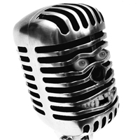
Intro page is a waste, on the 2nd page which should be the first page, do the mic in full color as its an awesome image.
Lots of black and a bit of grey is not my cup o'tea. Can you add a bit of brightness? Not looking for hot pink but just something a bit less noir.
Sound like a lot of complaints but actually I think if you make those small changes, the rest of the site is fine.
_________________
- Peter
audioconnell Voice Over Talent
Your friendly, neighborhood voice over talent |
|
| Back to top |
|
|
brianforrester
Backstage Pass

Joined: 30 Jul 2005
Posts: 492
Location: Vancouver, British Columbia, Canada
|
| Posted: Mon Oct 09, 2006 5:52 pm Post subject: |
|
|
Mike,
Design wise... I really like it. The feel of the site really matches what I think when I listen to your voice. Very clean, professionnal and functional...
A few suggestions:
- I'll echo the splash page sentiments, not necessary and just takes me one more click to get to what I really want... Your voice! However, I agree with Peter, you really need to work that microphone image into the site somewhere that does it justice, who can argue with a smokin' U87 ? 
- The "intro" page lacks some spice... the text all seems to just get lost on the page for me... I can't really pin it down, but if you could somehow work the mic image into it, I think the page itself would really pop. It appears that you are having some mapping issues on the page as well... the entire text frame is hyperlinked to http://www.michaelrhys.com/home.html... Also, I personally don't like sites that are written in 3rd person, when I know full well that it's a personal promotion site... if you were a small business with 6 employees selling multiple services I wouldn't be adverse to it.
- You may want to make the demos stand out a bit more... I might even suggest working the iPod player into your intro of home page, it might break up the text and really allows the listener to get down to business.
- Contact page works for me
- I like the client's page, however you're having the mapping issue again... a number of areas are linked to a mailto: command. Also, there is no navigation on the page, so if I want to get to your demos I have to use the back button and then find the "samples link.... okay, after I typed. that last part I realized that there is navigation, but it really blends into the other client logos... I guess that just reinforces that you should look at the method of navigation on the page... it somehow needs to be different from the logos
- Samples page, I like the iPod style control, however the size of the text was a bit of a challenge for me.
Don't get me wrong, design wise I really like it, just a few things that I think would make it even better.
Cheers,
Brian
_________________
Brian Forrester Voice Overs
www.brianforrester.com
brian@brianforrester.com
778.668.5715 |
|
| Back to top |
|
|
Mike
Nasty Brit
Joined: 10 Nov 2004
Posts: 476
Location: Tomorrowland
|
| Posted: Wed Oct 11, 2006 7:36 am Post subject: |
|
|
Thanks for the excellent feedback. I've made some interim adjustments and will do some more permanent fixes when I get the time.
The splash page is still there, but now has the links included to integrate it more closely into the design. I will try to eventually include the smoking Britmic in the info page and lose the opening splash page altogether.
I put more space around the links in the client page to seperate them more from the logos. Again, I might rework this later.
The mapping problems have been fixed.
The iPod has been enlarged to make reading the screen text easier. I'm thinking I might have now made it too big. Any thoughts?
I feel that self promotion in the 1st person is a tricky area as there is always the danger of it coming across as a touch arrogant and boastful. It requires a deft set of fingers to craft that kind of text. 3rd person is a lot easier for a hack like me.
Cheers again for the feedback. What a cool place this is!
Maiku.
_________________
www.michaelrhys.com
"If grass could run, cows would look like tigers."
Murray Wiggle |
|
| Back to top |
|
|
Bailey
4 Large

Joined: 04 Jun 2005
Posts: 4336
Location: Lake San Marcos... north of Connie, northwest of the Best.
|
| Posted: Wed Oct 11, 2006 8:35 am Post subject: |
|
|
Blacks and greys... professional looking.
... but I agree with Peter. That Union Jack mic needs brighter colors.
_________________
"Bailey"
a.k.a. Jim Sutton
Retired... Every day is Saturday, except Sunday.
VO-BB Member #00044  .gif" alt="W00T" border="0" /> .gif" alt="W00T" border="0" />
AOVA Graduate 02/2004 ;
"Be a Voice, not an Echo." |
|
| Back to top |
|
|
brianforrester
Backstage Pass
Joined: 30 Jul 2005
Posts: 492
Location: Vancouver, British Columbia, Canada
|
| Posted: Wed Oct 11, 2006 9:54 pm Post subject: |
|
|
As it in now Mike, I like it! The splash page works nicely as it is, because it doesn't appear to be a splash page, it's actually a directional page.
Good stuff!
Cheers,
Brian
_________________
Brian Forrester Voice Overs
www.brianforrester.com
brian@brianforrester.com
778.668.5715 |
|
| Back to top |
|
|
|

