| View previous topic :: View next topic |
| Author |
Message |
glittlefield
M&M

Joined: 08 Mar 2006
Posts: 2039
Location: Round Rock, TX
|
 Posted: Sun Feb 25, 2007 2:40 pm Post subject: Posted: Sun Feb 25, 2007 2:40 pm Post subject: |
 |
|
That's definitely a retro look and the best one yet, IMHO. Now you're drifting into my tastes. 
_________________
Greg Littlefield
VO-BB Member #59 |
|
| Back to top |
|
 |
Deirdre
Czarina Emeritus

Joined: 10 Nov 2004
Posts: 13026
Location: Camp Cooper
|
| Posted: Sun Feb 25, 2007 3:02 pm Post subject: |
|
|
Wow-- snazzy.
_________________
DBCooperVO.com
IMDB |
|
| Back to top |
|
|
vowannabe
Guest
|
| Posted: Tue Feb 27, 2007 9:32 pm Post subject: |
|
|
| I just tried your image with a very simple border of black and gray and think that it would realy add something. Will e-mail. [/img] |
|
| Back to top |
|
|
audio'connell
T-Shirt
Joined: 02 Feb 2005
Posts: 1974
Location: in a dark studio with a single bulb light...day after day after....
|
| Posted: Fri Mar 02, 2007 4:47 pm Post subject: |
|
|
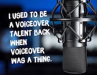
Sorry to be late to this party but for what its worth that last graphic, which I'm guessing is the one you are going with is awesome. I came across it the other night in another post and immediately really liked it.
what I would suggest for the web redesign (what do you mean he didn't ask for my opinion...when have I ever waited for an invitation is adding a line or a small streak of color. I immediately thought of electric blue with the black and white. a line here or there of that color with the prime black and white would be very cool
But the new icon is a terrific start. nice job, tell your graphics friend you'll voice a free spot for them.
_________________
- Peter
audioconnell Voice Over Talent
Your friendly, neighborhood voice over talent |
|
| Back to top |
|
|
|

