| View previous topic :: View next topic |
| Author |
Message |
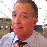
COURVO
Even Taller Than He Seems On TV
Joined: 10 Feb 2006
Posts: 1569
Location: Vegas, Baby!
|
 Posted: Wed Apr 16, 2008 5:57 pm Post subject: courvo logo Posted: Wed Apr 16, 2008 5:57 pm Post subject: courvo logo |
 |
|
Any and all feedback welcome on the possibility of using this as a new logo for website, print materials, and marketing.

Thanks!
CourVO
_________________
Dave Courvoisier - Las Vegas, NV
http://www.CourVO.com
CourVO@CourVO.com
Courvo's "Voice Acting in Vegas" Blog: http://www.CourVO.biz
on your phone at courvo.mobi
702.610.6288
"I'm not a news anchor, but I play one on TV." |
|
| Back to top |
|
 |
Moe Egan
4 Large
Joined: 11 Sep 2006
Posts: 4339
Location: Live Free or Die
|
| Posted: Wed Apr 16, 2008 6:03 pm Post subject: |
|
|
Dave,
That is NICE! Simple, sharp, professional. Love that it's just white and blue- the only thing I'd change is pick which "o" gets a picture. I'd like to see just the blue volume picture in the first "o"...the second "o" stands out enough as it is blue...the speaker inside of it takes away from its uniqueness if that makes any sense. Without the picture the "VO" meaning isn't watered down by the picture. Nit picking really....it's a beautiful design!
_________________
Moe Egan
i want to be the voice in your head.
~~~~~ |
|
| Back to top |
|
|
scottnilsen
King's Row

Joined: 12 Jul 2007
Posts: 1170
Location: Orange County, CA
|
| Posted: Wed Apr 16, 2008 6:04 pm Post subject: |
|
|
Very sharp. I like it a lot.
_________________
We have nothing to fear but fear itself.
Well, that and mimes.
(714)408-6405 www.scottnilsen.com |
|
| Back to top |
|
|
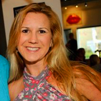
CarynClark
MMD
Joined: 28 Feb 2007
Posts: 2697
Location: Fort Myers, FL
|
| Posted: Wed Apr 16, 2008 6:07 pm Post subject: |
|
|
Love it!!!!!!!!!!! Damn, that is NICE!
Wish I had had your designer.
_________________
Caryn Clark... The Hip Chick Voice!
"A positive mental attitude and having faith in your ability is quite different from being irresponsible and downright stupid." - Dave |
|
| Back to top |
|
|
Bailey
4 Large

Joined: 04 Jun 2005
Posts: 4336
Location: Lake San Marcos... north of Connie, northwest of the Best.
|
| Posted: Wed Apr 16, 2008 6:13 pm Post subject: |
|
|
I like it Dave.
... but how about adding that red tie of yours, drapped over the lower part of the large letter C ?
It may warm the site up a bit.
_________________
"Bailey"
a.k.a. Jim Sutton
Retired... Every day is Saturday, except Sunday.
VO-BB Member #00044  .gif" alt="W00T" border="0" /> .gif" alt="W00T" border="0" />
AOVA Graduate 02/2004 ;
"Be a Voice, not an Echo." |
|
| Back to top |
|
|
todd ellis
A Zillion

Joined: 02 Jan 2007
Posts: 10542
Location: little egypt
|
| Posted: Wed Apr 16, 2008 6:20 pm Post subject: |
|
|
no b.s. ... i really, really like it. i wouldn't change a thing.
_________________
"i know philip banks": todd ellis
who's/on/1st?
 |
|
| Back to top |
|
|
bobsouer
Frequent Flyer

Joined: 15 Jul 2006
Posts: 9883
Location: Pittsburgh, PA
|
| Posted: Wed Apr 16, 2008 6:48 pm Post subject: |
|
|
Dave,
I too join the chorus. That is really sweet. Though I lean in Moe's direction on removing the filling from the second O.
_________________
Be well,
Bob Souer (just think of lemons)
The second nicest guy in voiceover.
+1-724-613-2749
Source Connect, phone patch, pony express |
|
| Back to top |
|
|
COURVO
Even Taller Than He Seems On TV
Joined: 10 Feb 2006
Posts: 1569
Location: Vegas, Baby!
|
| Posted: Wed Apr 16, 2008 6:48 pm Post subject: |
|
|
y'all are nice...very nice people....
Almost as soon as I posted it, though, I wondered if it should show my real name and/or a tagline.....like: Voice-Actor (or sumpin')
again....Thanks for the honest thoughts.
CourVO
_________________
Dave Courvoisier - Las Vegas, NV
http://www.CourVO.com
CourVO@CourVO.com
Courvo's "Voice Acting in Vegas" Blog: http://www.CourVO.biz
on your phone at courvo.mobi
702.610.6288
"I'm not a news anchor, but I play one on TV." |
|
| Back to top |
|
|
allensco
Flight Attendant

Joined: 30 Jul 2005
Posts: 823
Location: Alabama, USA
|
| Posted: Wed Apr 16, 2008 7:10 pm Post subject: |
|
|
Dave, don't touch it. LEAVE IT ALONE! Looks fantastic as it is!  |
|
| Back to top |
|
|
Deirdre
Czarina Emeritus

Joined: 10 Nov 2004
Posts: 13026
Location: Camp Cooper
|
|
| Back to top |
|
|
SoundsGreat-Elaine Singer
King's Row

Joined: 30 Dec 2004
Posts: 1055
Location: Toronto, Canada
|
| Posted: Wed Apr 16, 2008 7:41 pm Post subject: |
|
|
Very, very nice! Now having seen DB's renditions, I think the speaker in the final O kinda rounds it out and balances it.
_________________
Elaine
The Youthful Mature Voice (Emeritus)
Senectitude is not for the faint of heart. |
|
| Back to top |
|
|
paddyo
CM

Joined: 12 Jul 2006
Posts: 975
Location: New York City
|
| Posted: Wed Apr 16, 2008 8:05 pm Post subject: |
|
|
I really like it
Looks great
Paddyo |
|
| Back to top |
|
|
DougVox
The Gates of Troy

Joined: 10 Jan 2007
Posts: 1706
Location: Miami
|
| Posted: Wed Apr 16, 2008 8:09 pm Post subject: |
|
|
Clean, sharp, distinctive. Excellent! Your designer's a whiz with the lighting, it looks fabulous!
The only nit-picky thing I might suggest is to try a version of it without the reflection of the ".com." You might find that it looks cleaner without it. (Hey, I said it was nit-picky, didn't I???)
_________________
Doug Turkel (tur-KELL)
Voiceover UNnouncer®
UNnouncer.com |
|
| Back to top |
|
|
Yoda117
M&M

Joined: 20 Dec 2006
Posts: 2362
Location: Philadelphia, Pennsylvania
|
| Posted: Wed Apr 16, 2008 8:19 pm Post subject: |
|
|
Okay, three things here:
1) Axe the reflection on the bottom. It spells "Cook" and I kept thinking "kook" (as in nutty).
2) Don't change anything else... looks awesome!
3) I mean this in the nicest way, but f%&@ you! I'm still trying to find a graphic designer who won't flake out (We all remember thelogocompany.net, friends recommended a co-worker... didn't pan out, and Melissa recommended an awesome person who doesn't have time on her schedule to do it). Seriously though, this hits the edgy, hip, and professional buttons in my book 
please note that #3 is based on poster's frustration on trying to find a good, reasonably priced graphic artist ($2,000 is not a reasonable amount IMO for a single logo). Your logo makes me green with envy since it without a doubt, one of the cooler logos I've seen in recent memory
_________________
Voiceovers by Gregory Houser
Philadelphia based Voice Actor
Blog - A man, a martini, and a lot of microphones |
|
| Back to top |
|
|
Deirdre
Czarina Emeritus
Joined: 10 Nov 2004
Posts: 13026
Location: Camp Cooper
|
| Posted: Wed Apr 16, 2008 8:24 pm Post subject: |
|
|
for the record: I like the logo the way it is.
My submissions were just to show what those other ideas looked like.
_________________
DBCooperVO.com
IMDB |
|
| Back to top |
|
|
|


