| View previous topic :: View next topic |
| Author |
Message |
COURVO
Even Taller Than He Seems On TV
Joined: 10 Feb 2006
Posts: 1569
Location: Vegas, Baby!
|
 Posted: Wed May 21, 2008 6:46 pm Post subject: COURVO WEBSITE PROTOTYPE Posted: Wed May 21, 2008 6:46 pm Post subject: COURVO WEBSITE PROTOTYPE |
 |
|
Gettin' closer to the real thing, incorporating the universally-hailed Courvo-Logo.
Please let me know what you think before they code this thing.
Click HERE
I'm not married to this format...something seems to be lacking, but I can't quite put my finger on it. Maybe it's the white background...I dunno.
Suggestions appreciated.
CourVO
_________________
Dave Courvoisier - Las Vegas, NV
http://www.CourVO.com
CourVO@CourVO.com
Courvo's "Voice Acting in Vegas" Blog: http://www.CourVO.biz
on your phone at courvo.mobi
702.610.6288
"I'm not a news anchor, but I play one on TV." |
|
| Back to top |
|
 |
mcm
Smart Kitteh

Joined: 10 Dec 2004
Posts: 2600
Location: w. MA, USA
|
| Posted: Wed May 21, 2008 6:51 pm Post subject: |
|
|
Too much white.
And change the blue in the logo to smokin' orange. For hotness. |
|
| Back to top |
|
|
Yoda117
M&M

Joined: 20 Dec 2006
Posts: 2362
Location: Philadelphia, Pennsylvania
|
| Posted: Wed May 21, 2008 6:53 pm Post subject: |
|
|
 .gif" alt="W00T" border="0" /> .gif" alt="W00T" border="0" />
I'll be honest that it's not the most technically demanding site I've ever seen, but the inner geek in me likey.
 approved approved
EDIT: what happened to the site with the new logo...? I now have a much blander site on my web browser.
_________________
Voiceovers by Gregory Houser
Philadelphia based Voice Actor
Blog - A man, a martini, and a lot of microphones |
|
| Back to top |
|
|
COURVO
Even Taller Than He Seems On TV
Joined: 10 Feb 2006
Posts: 1569
Location: Vegas, Baby!
|
| Posted: Wed May 21, 2008 7:01 pm Post subject: |
|
|
| Yoda117 wrote: | | EDIT: what happened to the site with the new logo...? I now have a much blander site on my web browser. |
Greg...
????
Not sure I understand. I've never incorporated the logo into anything live on the web. This will be the first exposure.
CourVO
_________________
Dave Courvoisier - Las Vegas, NV
http://www.CourVO.com
CourVO@CourVO.com
Courvo's "Voice Acting in Vegas" Blog: http://www.CourVO.biz
on your phone at courvo.mobi
702.610.6288
"I'm not a news anchor, but I play one on TV." |
|
| Back to top |
|
|
Yoda117
M&M
Joined: 20 Dec 2006
Posts: 2362
Location: Philadelphia, Pennsylvania
|
|
| Back to top |
|
|
Rob
Guest
|
| Posted: Wed May 21, 2008 7:13 pm Post subject: |
|
|
Heeeyyyy...Not bad, NOt bad.
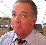
But, that guy in the photo ... whew! Those post office shots just don't cut it my friend. Even when they add color. Don't be shy ... use a picture of yourself.
(what? him? no ... are you sure? ... )
Hey look, uh ... no, that's a great photo ... Yessir, Great! Why, I was telling everyone on the BB what a great picture that was just before you got here ... Yeeeaaahhhh ... |
|
| Back to top |
|
|
todd ellis
A Zillion

Joined: 02 Jan 2007
Posts: 10542
Location: little egypt
|
| Posted: Wed May 21, 2008 7:16 pm Post subject: |
|
|
i really like it - but i'm with mcm - make it a black background.
_________________
"i know philip banks": todd ellis
who's/on/1st?
 |
|
| Back to top |
|
|
Moe Egan
4 Large
Joined: 11 Sep 2006
Posts: 4339
Location: Live Free or Die
|
| Posted: Wed May 21, 2008 7:28 pm Post subject: |
|
|
Love it, but (okay I realize this is wicked nit picking) I don't think your head shot "goes" with the site. The blue and black is so spit polished and professional and your head shot is (although smokin hot) very casual and yellow. Perhaps a more formal headshot with colors that "go with" the look and feel of the site rather than fight against it? But ez nice. 
_________________
Moe Egan
i want to be the voice in your head.
~~~~~ |
|
| Back to top |
|
|
Lizden
A Zillion
Joined: 04 Dec 2006
Posts: 8864
Location: The dark recesses of my mind
|
| Posted: Wed May 21, 2008 8:00 pm Post subject: |
|
|
OK...just to make your life easier...I'm going to disagree with MCM & Todd (sorry guys!  ) )
I actually LIKE the white.
I find all-black backgroud sites too hard to read....but that's just me!
Having the logo & sides framing the site works really nicely with the white in your site I find!
I do agree that the yellow headshot (while HOT! ) does take away from the crisp feel of the site.
What about taking that picture & converting it to Black & White?
But yeah...I think it's very cool!!!!
L.
_________________
Liz de Nesnera O.A.V. ~ Livin' The VO Dream!
English/French Bilingual VO w/ ISDN
HireLiz.com / liz@hireliz.com |
|
| Back to top |
|
|
ricevoice
Cinquecento

Joined: 28 Dec 2007
Posts: 532
Location: Sacramento, CA
|
| Posted: Wed May 21, 2008 8:23 pm Post subject: |
|
|
| Moe Egan wrote: | | Love it, but (okay I realize this is wicked nit picking) I don't think your head shot "goes" with the site. The blue and black is so spit polished and professional and your head shot is (although smokin hot) very casual and yellow. Perhaps a more formal headshot with colors that "go with" the look and feel of the site rather than fight against it? But ez nice. |
Or even Photoshopping the shirt in the headshot to a blue or black (really not sure if that's technically do-able or not) could make it fit a little better.
Really nice, slick look though!
_________________
Chris Rice - Noisemaker
www.ricevoice.com |
|
| Back to top |
|
|
DougVox
The Gates of Troy

Joined: 10 Jan 2007
Posts: 1706
Location: Miami
|
| Posted: Wed May 21, 2008 8:35 pm Post subject: |
|
|
Dave,
The site looks great, and I come down on the "too much white" side of the fence. And while the fans of your hotness may not agree, why even have the photo if you're not selling yourself as on-camera talent? (Of course, if you plan to add those services to the site later, please disregard.)
And while it might still be too early in the process to mention this, I couldn't help but notice a few typos. Most notably, "demo's" appears three times on the page, and all three incorrectly include an apostrophe. I'll skip the rest for now since it's still a work-in-progress.
_________________
Doug Turkel (tur-KELL)
Voiceover UNnouncer®
UNnouncer.com |
|
| Back to top |
|
|
Deirdre
Czarina Emeritus

Joined: 10 Nov 2004
Posts: 13026
Location: Camp Cooper
|
| Posted: Wed May 21, 2008 8:45 pm Post subject: |
|
|
Yeah, that apostrophe has to go.
Try to keep the page to 600px high.
The Emmy award needs more headroom in its tile.
Skip the "links".
There are way better pix of you.
"A reputation built on honesty and integrity"?
You're not running for sheriff, d00d.
You are TEH HOTNESS PERSONIFIED.
I love the look of the crystal tabs across the top.
Love the spiffy demo player layout!!!
The Courvo logo is just grand, grand, grand.
Black is the key as the others have said-- think polished granite.
remember: HOT-NESS.
Live it.
_________________
DBCooperVO.com
IMDB
Last edited by Deirdre on Wed May 21, 2008 8:49 pm; edited 1 time in total |
|
| Back to top |
|
|
louzucaro
The Gates of Troy
Joined: 13 Jul 2006
Posts: 1915
Location: Chicago area
|
| Posted: Wed May 21, 2008 8:47 pm Post subject: |
|
|
Hi Dave,
Well as you know, I think for the money this is pretty spiffy overall.
I'm in the too much white camp, too, but not because I think there should be less "white space" but because I don't think it should be white...the contrast is too great.
And again, I'd prefer to see the COURVO at the top moved right so that its left edge is aligned with the left part of the logo, and moved down so that it's centered in that top bar. Similarly, I'd prefer to see the logo box moved down so that its top edge is lined up with the top edge of the Demos box.
Another thing is that your navigation should DEFINITELY include a "Home" link...even though you could get away with clicking on the courvo.com or the logo to go back home, nothing's as quickly intuitive as an actual Home navigation item.
Do you know if your designer has given thought to what will be on the screen "outside" of this interface? For instance, for anybody whose desktop resolution is bigger than what you posted, what will occupy the rest of the screen? I would suggest having them mock it up quickly (can be done in a minute or two) with a few different colors or backgrounds, if not using a solid color, so that you can get a feel for what you prefer.
There are a couple other very nitpicky things, but I know this is still a work in progress, so they're not worth mentioning.
Overall, again, I think the general feel is very slick and keeping in line with the super-coolness of your snazzy new logo!
Here's a mockup of what I meant by my comments re: alignment of the various elements:
click click click
_________________
Lou Zucaro
http://www.voicehero.com
"Well, yeah, there's my favorite leaf!" |
|
| Back to top |
|
|
COURVO
Even Taller Than He Seems On TV
Joined: 10 Feb 2006
Posts: 1569
Location: Vegas, Baby!
|
| Posted: Wed May 21, 2008 10:10 pm Post subject: |
|
|
Wow! Have I ever mentioned how much you all mean to me??!!
Many thanks.
Personally, I'm torn on presence or absence of the apostrophe on the demo word.
The apostrophe connotes a contraction of the word "DEMONSTRATIONS", ergo the apostrophe is appropriate in my mind. It's not meant to be possessive, or a contrction for "demo is", so I think it stays.
Of course, I can be swayed easily...so hit me with your best counter-argument.
I pretty much agree with all the rest of what you're saying. I am going to shoot for another pic....a different background, some alignment changes, and I'm waffling on honesty and integrity -- not the virtues -- but it being stated like that.
THANKS!!!
CourVO
_________________
Dave Courvoisier - Las Vegas, NV
http://www.CourVO.com
CourVO@CourVO.com
Courvo's "Voice Acting in Vegas" Blog: http://www.CourVO.biz
on your phone at courvo.mobi
702.610.6288
"I'm not a news anchor, but I play one on TV." |
|
| Back to top |
|
|
scottnilsen
King's Row

Joined: 12 Jul 2007
Posts: 1170
Location: Orange County, CA
|
| Posted: Wed May 21, 2008 10:52 pm Post subject: |
|
|
Sorry Courvo...the apostrophe needs to go, even if "demos" is shortened form of "demonstrations."
_________________
We have nothing to fear but fear itself.
Well, that and mimes.
(714)408-6405 www.scottnilsen.com |
|
| Back to top |
|
|
|


