| View previous topic :: View next topic |
| Author |
Message |
louzucaro
The Gates of Troy
Joined: 13 Jul 2006
Posts: 1915
Location: Chicago area
|
 Posted: Sat May 31, 2008 6:16 am Post subject: Posted: Sat May 31, 2008 6:16 am Post subject: |
 |
|
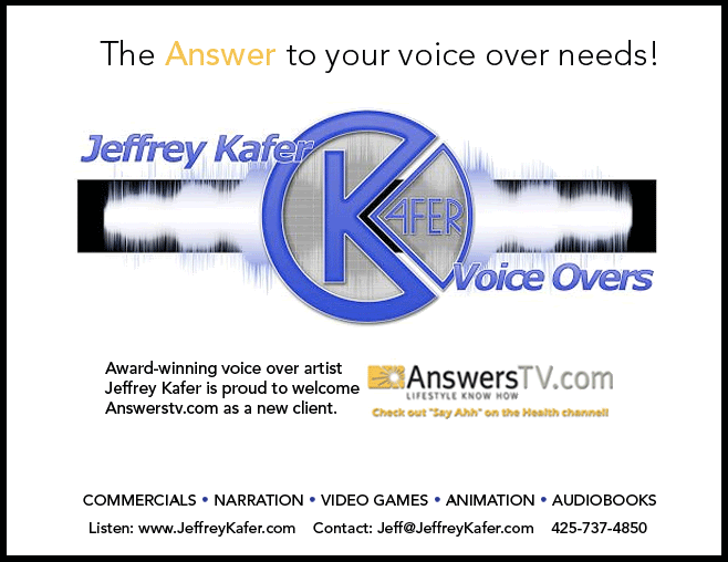
This is nitpicky, but did you consider Solution instead of Answer...just because an answer goes with a question, not a need. I mean, people will obviously get it, but you might get the stickler with a $5k job who'll think "Answer? What's the question?"
Like I said, nitpicky.
_________________
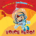
Lou Zucaro
http://www.voicehero.com
"Well, yeah, there's my favorite leaf!" |
|
| Back to top |
|
 |
JBarrett
M&M

Joined: 19 Feb 2007
Posts: 2043
Location: Las Vegas, NV
|
| Posted: Sat May 31, 2008 6:23 am Post subject: |
|
|
I believe the decision to use "Answer" is tied to the AnswersTV.com plug on the lower part of the card.
_________________
Justin S. Barrett
http://www.justinsbarrett.com/ |
|
| Back to top |
|
|
louzucaro
The Gates of Troy
Joined: 13 Jul 2006
Posts: 1915
Location: Chicago area
|
| Posted: Sat May 31, 2008 6:46 am Post subject: |
|
|
Right, I know, but now that it's been reworked to be more of a Jeffrey Kafer ad than an AnswersTV.com thing...
_________________
Lou Zucaro
http://www.voicehero.com
"Well, yeah, there's my favorite leaf!" |
|
| Back to top |
|
|
JBarrett
M&M
Joined: 19 Feb 2007
Posts: 2043
Location: Las Vegas, NV
|
| Posted: Sat May 31, 2008 7:13 am Post subject: |
|
|
While I'm new to this whole marketing game, I don't feel that a client is going to pass on an artist because they went with a clever word connection in their advertising instead of being 100% grammatically correct. To me, Jeff still stands out as the primary focus of the card, with AnswersTV.com coming in second place, and the use of "Answer" at the head helps to connect the main point (Jeff) with the recent client he's plugging. If it were "Solution," I feel it wouldn't stick as well in someone's mind. If I were the client and happened to stumble across AnswersTV.com several weeks after receiving the card, I feel it would be easier to remember Jeff if "Answer" had been drilled in twice instead of just once.
_________________
Justin S. Barrett
http://www.justinsbarrett.com/ |
|
| Back to top |
|
|
RayAnime
Been Here Awhile

Joined: 20 Mar 2008
Posts: 227
Location: The fabulous New York City
|
| Posted: Sat May 31, 2008 7:45 am Post subject: |
|
|
Yay! It's looking good!
Here's my 2 cents--not sure if it's along the direction you're headed, but I tried to pull something together that had clean lines and still communicated the "Answer" concept. The spacing's not perfect but I just figured I'd add my idea to the pile!
love? hate? meh?
 |
|
| Back to top |
|
|
Jowillie
Lucky 700
Joined: 20 Aug 2006
Posts: 714
Location: North Carolina
|
|
| Back to top |
|
|
RayAnime
Been Here Awhile
Joined: 20 Mar 2008
Posts: 227
Location: The fabulous New York City
|
| Posted: Sat May 31, 2008 8:19 am Post subject: |
|
|
| Thx! It could probably do with being punched up a bit (esp, the headline), but I'm always a sucker for a nice thin sans serif. |
|
| Back to top |
|
|
Yoda117
M&M

Joined: 20 Dec 2006
Posts: 2362
Location: Philadelphia, Pennsylvania
|
|
| Back to top |
|
|
audio'connell
T-Shirt
Joined: 02 Feb 2005
Posts: 1974
Location: in a dark studio with a single bulb light...day after day after....
|
| Posted: Sat May 31, 2008 9:55 am Post subject: |
|
|
I like the border you added. Maybe if Jeff added that in his blue color that could be cool...blue...cool...wow, karma.
I don't mind the font change as I'm not a fan of the eras font Jeff uses but it may be the look he's established for the company.
I'm a font snob (I'm not knowledgeable enough to be a wine snob and nobody really pays attention to mic snobs so its all I've got)
Jeff, I think you're coming to the point of too many chefs so I'll bow out having started all this trouble 
I'm good with whatever you like.
_________________
- Peter
audioconnell Voice Over Talent
Your friendly, neighborhood voice over talent |
|
| Back to top |
|
|
Jeffrey Kafer
Assistant Zookeeper

Joined: 09 Dec 2006
Posts: 4931
Location: Location, Location!
|
| Posted: Sat May 31, 2008 12:04 pm Post subject: |
|
|
The fat eras font is what I use on my website and CDs, so I'd like to stick with it. I'll play around and see what I can do.
Thanks everyone!
_________________
Jeff
http://JeffreyKafer.com
Voice-overload Web comic: http://voice-overload.com |
|
| Back to top |
|
|
RayAnime
Been Here Awhile
Joined: 20 Mar 2008
Posts: 227
Location: The fabulous New York City
|
| Posted: Sat May 31, 2008 1:48 pm Post subject: |
|
|
I still like your version of the postcard! I just figured I'd put what I was thinking out there--at least for me, I find that seeing other people's ideas can inform my own choices, even if it's just in the sense that I'm more convinced about what I chose in the first place! Hope the things we've tossing at you have added to your own creative process!!!
Nothing wrong your font . . . if you were going to tweak your latest version at all, my input would be to watch out for too many different-yet-similar font sizes (which can make it hard for the eye to know exactly where to go first, or figure out what's most important) and keep an eye on the balance between the different elements on the page. This may just be me, but the way it's laid out right now, I think you have three strong visual elements that are almost lined up with one another down the center of the page, but they're askew enough that it makes things feel just a bit off: the big yellow "answer," the open area of the circle in your logo, and the Answerstv logo (including the white space to the left of that logo). I'm not saying you should line them up, I just think perhaps if you play with shifting things around a bit you may find a better balance between the elements.
I also think that perhaps having everything centered is making things feel a bit clunky in the middle of the page, if only because your logo has a nice left-to right flow even though there is a strong element in the middle of it (the circle), but then the other text/images on the page force the eye to back to the center since all of your strong visual elements are kind of clumped there down the middle, so there's a bit of a visual tug-of-war happening. I don't know if this is making sense . . . I hope I'm not seeming overly nit-picky, just trying to break down my thoughts and what you could do with your already nice-looking design.
All that being said I do still like your card! I'm certainly not the last word on what you should do! |
|
| Back to top |
|
|
Jeffrey Kafer
Assistant Zookeeper
Joined: 09 Dec 2006
Posts: 4931
Location: Location, Location!
|
|
| Back to top |
|
|
mcm
Smart Kitteh

Joined: 10 Dec 2004
Posts: 2600
Location: w. MA, USA
|
| Posted: Sat May 31, 2008 6:54 pm Post subject: |
|
|
A stamp is good  |
|
| Back to top |
|
|
bobsouer
Frequent Flyer
Joined: 15 Jul 2006
Posts: 9883
Location: Pittsburgh, PA
|
| Posted: Sat May 31, 2008 8:37 pm Post subject: |
|
|
Mary made me laugh tonight!
_________________
Be well,
Bob Souer (just think of lemons)
The second nicest guy in voiceover.
+1-724-613-2749
Source Connect, phone patch, pony express |
|
| Back to top |
|
|
Jeffrey Kafer
Assistant Zookeeper
Joined: 09 Dec 2006
Posts: 4931
Location: Location, Location!
|
| Posted: Sat May 31, 2008 8:44 pm Post subject: |
|
|
Alright. Last one, Heeding nits of everyone's advice I think I have the best of the bunch so far. Sure hope so, I've spent an awful of time on one simple postcard.

_________________
Jeff
http://JeffreyKafer.com
Voice-overload Web comic: http://voice-overload.com |
|
| Back to top |
|
|
|

