| View previous topic :: View next topic |
| Author |
Message |
CarynClark
MMD
Joined: 28 Feb 2007
Posts: 2697
Location: Fort Myers, FL
|
 Posted: Wed Mar 05, 2008 9:31 am Post subject: DING! Round 2.... Posted: Wed Mar 05, 2008 9:31 am Post subject: DING! Round 2.... |
 |
|
Ok, here are the spiffied designs based on feedback I gave the designer. He was awesome... went through each design, explained why he used the font, color, etc. he did, etc. Based on feedback received, the majority liked the concept of the first design, and so we agreed to expand on that.
He also had another concept come to him while doing this, which he's also included. Clever!! Now I can't choose!
Also, feedback on fonts would be appreciated. He's given examples of fonts on the back page that he feels will replicate onto other mediums well - in other words, will be legible if the logo is smaller, etc.
THANKS for your thoughts!!!
2295_HC_logoConcepts_3_5[1].pdf (97.3 KB bytes) => http://www.onlinefilefolder.com/index.php?action=getshare&type=0&user_num=35678&share_id=190907&hash=9e6bf3dd09ec48fe5c510e2843deee7a
_________________
Caryn Clark... The Hip Chick Voice!
"A positive mental attitude and having faith in your ability is quite different from being irresponsible and downright stupid." - Dave |
|
| Back to top |
|
 |
bobsouer
Frequent Flyer
Joined: 15 Jul 2006
Posts: 9883
Location: Pittsburgh, PA
|
| Posted: Wed Mar 05, 2008 10:02 am Post subject: |
|
|
Caryn,
I like page 3 the best.
_________________
Be well,
Bob Souer (just think of lemons)
The second nicest guy in voiceover.
+1-724-613-2749
Source Connect, phone patch, pony express |
|
| Back to top |
|
|
Yoda117
M&M

Joined: 20 Dec 2006
Posts: 2362
Location: Philadelphia, Pennsylvania
|
|
| Back to top |
|
|
Bailey
4 Large

Joined: 04 Jun 2005
Posts: 4336
Location: Lake San Marcos... north of Connie, northwest of the Best.
|
| Posted: Wed Mar 05, 2008 10:22 am Post subject: |
|
|
I like the #1... a hip chick, standing out above the crowd...
But #3... says something new and different is "breaking out of the shell".
So... #3 has my vote.
_________________
"Bailey"
a.k.a. Jim Sutton
Retired... Every day is Saturday, except Sunday.
VO-BB Member #00044  .gif" alt="W00T" border="0" /> .gif" alt="W00T" border="0" />
AOVA Graduate 02/2004 ;
"Be a Voice, not an Echo." |
|
| Back to top |
|
|
imaginator
The Thirteenth Floor

Joined: 10 Nov 2004
Posts: 1348
Location: raleigh, nc
|
| Posted: Wed Mar 05, 2008 10:54 am Post subject: |
|
|
for what it's worth, i'd go with #3, but keep the faint reflection of the mic grill on the eggshell.
of course, my opinion and a dollar will get you a cup of coffee if you're not too picky where you buy it.
_________________
rowell gormon
www.voices2go.com
"Mr. Warm & Friendly Voice...with Character!"
Rowell Gormon's Clogged Blog - http://voices2go.com/blog |
|
| Back to top |
|
|
Gp
Guest
|
| Posted: Wed Mar 05, 2008 11:05 am Post subject: |
|
|
| well I have to go number 3 as well. It's got all the elements. |
|
| Back to top |
|
|
dagoldenknight86
Guest
|
| Posted: Wed Mar 05, 2008 12:30 pm Post subject: |
|
|
| I like #3 too! |
|
| Back to top |
|
|
louzucaro
The Gates of Troy
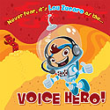
Joined: 13 Jul 2006
Posts: 1915
Location: Chicago area
|
| Posted: Wed Mar 05, 2008 3:56 pm Post subject: |
|
|
Well for somebody who posted a picture of a "slutty" (ahem) space girl previously, I'm gonna go against the grain and say that I actually prefer #1 at this point.
First, as DB mentioned with regard to something I'd done on my new website, I think the leg going off to the right tends to draw the eye away from the rest of the logo in #3, but with that said, I like the positioning of elements in #3 better than #4, so I'm not sure I'd "fix" that issue by suggesting you go with #4.
But I just kinda feel like that particular leg and shoe, together, are very "glam" and "showgirly" and since the rest of the person isn't attached to the leg, there isn't anything else to go on to suggest any contradictory vibe.
So if that's accurate...if you come across as 'glam' and 'showgirly'...then I think it fits, but if not, maybe it's something to consider / tweak if that ends up being your favorite.
Just my thoughts.
_________________
Lou Zucaro
http://www.voicehero.com
"Well, yeah, there's my favorite leaf!" |
|
| Back to top |
|
|
CarynClark
MMD
Joined: 28 Feb 2007
Posts: 2697
Location: Fort Myers, FL
|
| Posted: Wed Mar 05, 2008 5:11 pm Post subject: |
|
|
I really appreciate all of these comments.
I have to share my husband's comments. It was my big chuckle for the day. He said:
"hmmm. A fat, redneck bird...a Barbara Bush bird...or a whore hatching out of an egg??? It's so hard to choose...."
I'm still laughing at that!!!! Funny guy.
That said, though, I really am leaning toward #1 or #3. If #1, then the boots need to be a little different and I'm not sure of the significance of two stars on the head - one will do, Ithink. If #3, I think I'd like the leg to look a little more delicate. Or maybe an arm with a mic or something? I dunno.
I really do appreciate ALL comments... no right or wrong answers here. Please weigh in if you have time!!!! THANKS!!!!
_________________
Caryn Clark... The Hip Chick Voice!
"A positive mental attitude and having faith in your ability is quite different from being irresponsible and downright stupid." - Dave |
|
| Back to top |
|
|
allensco
Flight Attendant

Joined: 30 Jul 2005
Posts: 823
Location: Alabama, USA
|
| Posted: Thu Mar 06, 2008 9:42 am Post subject: |
|
|
Yeah....#3 for me too. I like the Ho hatching out  |
|
| Back to top |
|
|
Rognog
Flight Attendant
Joined: 20 Apr 2006
Posts: 807
Location: New Jersey
|
| Posted: Thu Mar 06, 2008 12:06 pm Post subject: |
|
|
Number One is #1!
_________________
Tom Dheere - The "H" is Silent, but I'm Not!
www.tomdheere.com |
|
| Back to top |
|
|
louzucaro
The Gates of Troy
Joined: 13 Jul 2006
Posts: 1915
Location: Chicago area
|
| Posted: Thu Mar 06, 2008 3:55 pm Post subject: |
|
|
| allensco wrote: | | Yeah....#3 for me too. I like the Ho hatching out |
Please send new keyboard to:
Lou Zucaro
1350 Remington Road
Suite L
Schaumburg, IL 60173
Thanks Allen!
_________________
Lou Zucaro
http://www.voicehero.com
"Well, yeah, there's my favorite leaf!" |
|
| Back to top |
|
|
dagoldenknight86
Guest
|
| Posted: Thu Mar 06, 2008 4:09 pm Post subject: |
|
|
| Oh.. that is precious! |
|
| Back to top |
|
|
Bruce
Boardmeister

Joined: 06 Jun 2005
Posts: 7980
Location: Portland, OR
|
| Posted: Fri Mar 07, 2008 8:08 am Post subject: |
|
|
I definitely think #1 is memorable and will get an immediate and fun reaction from viewers. Yes, either a regular eye or maybe a slightly sexy eyelash would be better than the stars.
I also like the top two type styles on the fifth page because the curve of the letter K enforces the look of the boot.
Fun.
B
_________________
VO-BB Member #31 Enlisted June, 2005

I'm not a Zoo, but over the years I've played one on radio/TV. . |
|
| Back to top |
|
|
Mike Patrick
Guest
|
| Posted: Fri Mar 07, 2008 9:04 am Post subject: |
|
|
| I completely agree with Bruce on selection #1 and for the reasons he states. I also dig the boots...maybe some stellato's?....We won't go there..ok? |
|
| Back to top |
|
|
|

